Hi again.
Today I'll show you a template redisigning I've made for a friend's blog.
He was using a common blogger template. Quite OK, but not fancy enough!
I was telling him I wouuld make soon a new banner for my blog, when he asked me to make one for him aswell.
I ended doing his banner first, and also changing his background and also adding a favicon.
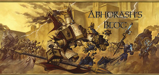
Abhorash, my friend, is currently suffering from a Warmachine/Menoth-fever, so I decided to go heavy when making the 3 designs. The banner looks so:
For the overall look of the redesigned blog, please go to Abhorash's Blog!
There you could see lots of Menoth miniatures, among other kinds of minis, WHFB, WH40K, terrain projects, etc. He owns like 300 armys. Kidding, only 10 or 11 xD
Anyways, he was the owner of our FLOS (friendly local online store!) and has a lot of armys to show , and lots of things to display, quite often.
Hope you like his new blog appearance. Tell me -and him- what you think about it!
Well, until next time.
See ya!
UPDATE: I've done some modifications to my blog aswell!! New background and updated banner ;D
Old and new one:


Thanks a lot my friend!
ReplyDeleteLooks cool. May his blog crush all others before it.
ReplyDeleteWell, except ours of course.
They're both beauties, and your banner is somehow even creepier than before! You've got real talent.
ReplyDeleteBanner looks awesome
ReplyDeleteAwesome!! I know who I will ask for help when I go and redesign mine!
ReplyDeleteBard
Thank you guys! Glad you like the new banners too!
ReplyDelete@Porky: Hahaha! Thanks! I made the image a bit more sharp, and looks cool, doesn't it? =D
@Black Bard: No problem, if I can help, I will do it happily ;D
Really awesome work on the banner, Nesbet. Once again I'm super impressed with what you can do. All three elements that you designed are great but I actually think my favorite might be the little Menoth icon. I like that subtle touch, it's classy.
ReplyDeleteYour own redesigned banner definitely looks great as well. The previous version was good but I think this is an improvement. Like I said before, awesome!
Thanks PapaJJ. My old banner needed the retouch. I made the old one like... 4 years ago? maybe more xD to have it as a firm for the forums.
ReplyDeleteI thought I would change the image, for something else, and the font. Even thought about creating my own font, but then I changed my mind and kept the previous image, worked on it, made it bigger and sharper. Added shadows to the blog name and changed some colours. And voilà. =D