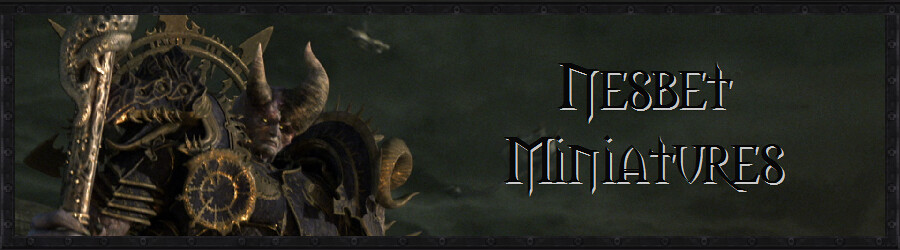
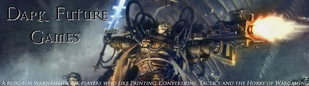
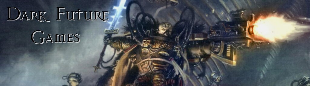
Not any new miniatures pics. Sorry. But now I can show you (because yesterday , I couldn't) my entry to the banner contest that's running by Dark Future Games, a cool and well-known blog I've been following for a while.
The rules of the contest can be read HERE, and the entries, RIGHT HERE.
Mine is the 6th entry, the one with the Dark Inquisitor, as said by Old School Terminator.

I also made 2 variants for my entry: the same banner but using their classic description, and also without any description (thinking about when DFG decides to change it somewhen in the future).
And last but not least, I added 2 variants for a favicon. I found favicon quite fancy, and DFG didn't have one yet. Quite simple, but nice looking, aren't they?


Well, I think Old School Terminator and his budies are the ones who will decide who wins, but I will appreciate some support in the comments sections =3
What do you think? Who should win? Say it in the entries anouncement post, in DFG!
Whoa! That looks awesome, Nesbet!! You impress me all the time with your many talents... is there anything you can't do? Good luck with the contest, I'm cheering for you!
ReplyDeleteThank for your support Jason!! =D
ReplyDeleteYep, that's the one that stood out to me. When I saw it was yours, even better! Really nice.
ReplyDeleteThanks for your words James ;D
ReplyDeleteEven I as an entrant have to admit this is beautiful.
ReplyDeleteMy only issue is that the blog text doesn't "pop" enough to stand out. Lightening the gray drop shadow/bevel to more white would probably sort that out, or artificially darkening the top left corner a little more.
Thank you fester, I appreciate your comment, specially being you one of the competitors! =D
ReplyDeleteI think you are right, the text could pop a little more. I worked that a little, but didn't figured it out to darken the left corner a bit more to make more contrast. Nice idea! ;D
Nice and cool! I like it too. Agree with Fester too, the blog title name is not obvious enough.
ReplyDeleteFirst look, my eye fall upon the bolter fire, then I see the Inquisitor, then I see the title. Probably the text could be more obvious with colours and font selection.
Cool! and good luck! Cheers!